
In 1985, you made your most important photographic decision before you took a single frame.
It happened at a shop counter, in front of a wall of small yellow and white boxes. Kodachrome or Tri-X? Velvia or Portra? Whatever you picked, you were committed. For the next 24 or 36 exposures, that emulsion decided how the world would look to you: how red a red could get, how deep a shadow would fall, whether skin would glow or go clinical. You could not change your mind at frame twelve. You could not apply it afterwards. You chose your film, you loaded it, and you lived with it.
Digital photography quietly deleted that decision. Every sensor renders the world one way, and everything else is something you do later, to a file, at your computer.
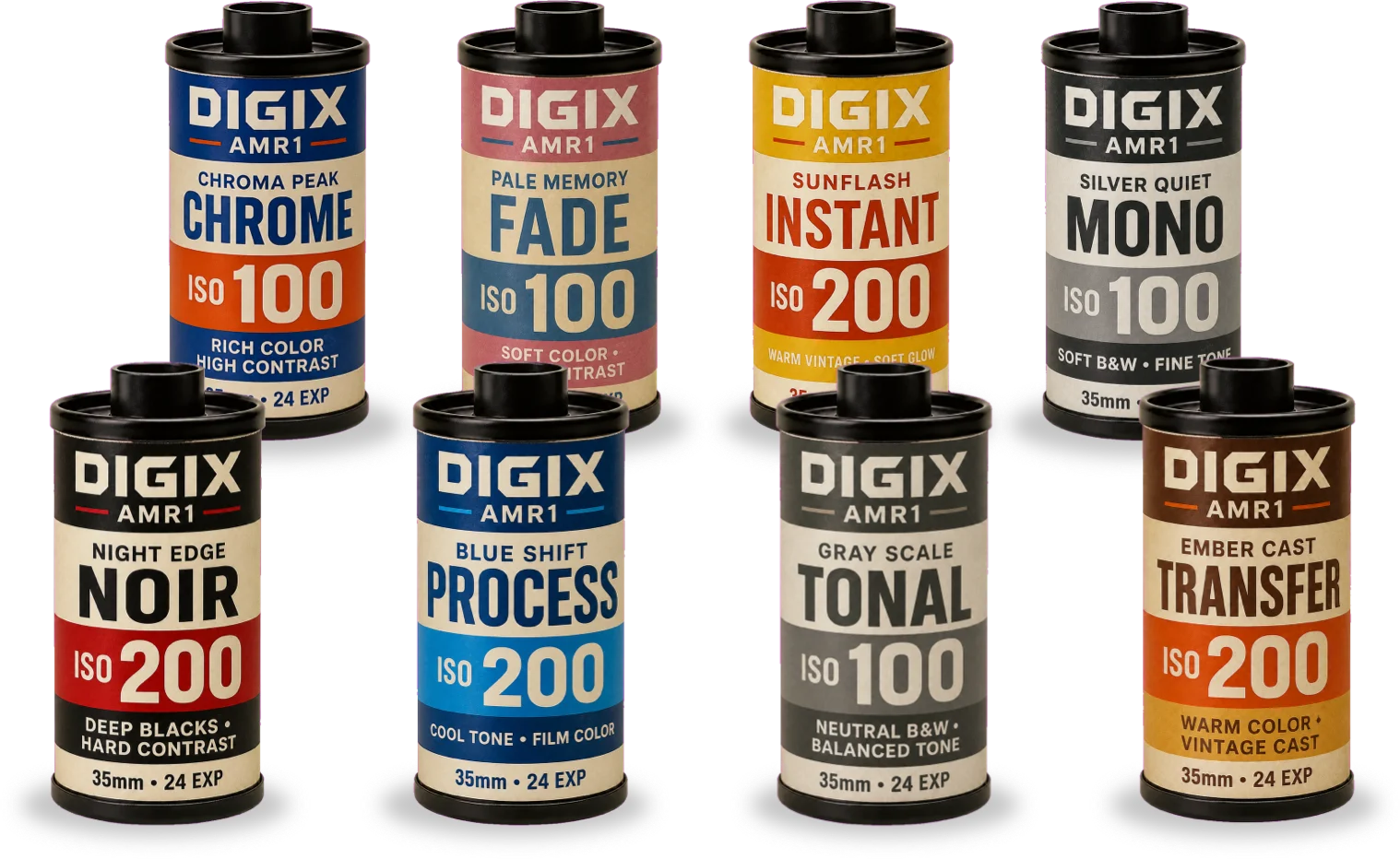
DIGIX AMR1 version 2.2 gives the decision back. Eight film simulations now live in the camera, chosen before you shoot, the way you would have loaded a roll: Chrome, Fade, Instant, Mono, Noir, Process, Tonal, and Transfer.
They are not filters, and we did not name them at random. Each one descends from a real emulsion or a real darkroom process, with a real reason photographers reached for it. This article is the story of those eight, and a practical guide to knowing which one to load.
Why Films Actually Looked Different
Before the eight, it helps to know why any of this was ever true — because the differences between film stocks were physical, not decorative.
Black-and-white film is a suspension of silver halide crystals in gelatin. Bigger crystals catch light more readily, so the film is faster, but you can see them: that is grain. Smaller crystals hold detail beautifully but need more light to register. That single trade-off is the whole reason a photographer owned more than one kind of film.¹
Color worked on a second axis. Negative film records an inverted image with generous exposure latitude, forgiving of mistakes. Reversal film — slide film — produces a positive image directly on a transparent base, with far more vibrant color, finer grain and better resolution, but dramatically less room for error. Until roughly 1995, transparency was the preferred medium for publication precisely because of that contrast and resolution.²
Look closely at the eight canisters above and you will see this logic preserved. The four smooth, detailed looks — Chrome, Fade, Mono, Tonal — are rated ISO 100. The four with grit, contrast or a pushed character — Instant, Noir, Process, Transfer — are ISO 200. That is not decoration. That is how film behaved.
The Eight Films
Chroma Peak CHROME — ISO 100 · Rich Color, High Contrast
The real thing. "Chrome" was photographers' shorthand for a transparency, and the great reversal films all carried the suffix: Kodachrome, Ektachrome, Fujichrome, Agfachrome.² Kodachrome arrived in 1935 and was unlike anything else — it carried no dye couplers in the emulsion at all, so the color was formed during development in the notoriously complex K-14 process, which needed four separate developers. Kodak ended manufacture in 2009, and the last lab on earth still able to process it, Dwayne's Photo in Parsons, Kansas, shut the line down on 30 December 2010.³
Steve McCurry shot his 1984 National Geographic portrait of Sharbat Gula on Kodachrome, and praised its palette as poetic and elegant rather than garish.³ Fujifilm's Velvia, launched in 1990 at ISO 50, took the opposite approach: extreme saturation, high contrast and the highest resolving power of any slide film, which made it the landscape photographer's obsession. Its exposure latitude was about half a stop.⁴
When to load it. Bright, directional daylight. Landscapes, architecture, travel, markets, anything already colorful that you want rendered bigger than life. Chrome rewards precision and punishes carelessness — which is exactly why images made with it look considered.
Pale Memory FADE — ISO 100 · Soft Color, Low Contrast
The real thing. Every color photograph is slowly dying. The image is held in three dye layers, and those dyes undergo spontaneous chemical change over time. Crucially, they do not fade at the same rate — the cyan and yellow dyes go first, which is why aged film drifts toward that unmistakable soft magenta cast. Modern color films show significant fading after roughly forty years at room temperature; cold storage can stretch that to centuries.⁵
Photographers eventually stopped treating this as damage and started treating it as a palette — shooting long-expired stock on purpose, and embracing the lo-fi unpredictability that the Lomography movement made respectable. The gentler end of the same territory is Kodak's Portra line, built deliberately around a restrained, natural palette for portrait, fashion and travel work rather than a punchy one.⁶
When to load it. Overcast and flat light, where contrast would only fight you. Personal work, family frames, quiet streets, anything where the subject is memory rather than fact. Fade makes a photograph feel like it has already been kept for a while.
Sunflash INSTANT — ISO 200 · Warm Vintage, Soft Glow
The real thing. The Polaroid SX-70, produced from 1972 to 1981, was the world's first instant SLR, and its integral film was a small miracle: every layer needed to expose, develop and fix the picture sealed inside one sheet, no peeling, no chemical mess, fully developed within about ten minutes. The film was rated ASA 150 at launch, raised to 160 mid-decade.⁷
That famous warm cast is not styling — it is temperature. Polaroid's own guidance is that pictures develop properly between roughly 55°F and 82°F; above that range the chemistry shifts yellow, red and pink, and below it images come out flat and green-tinted.⁸ Every warm, glowing Polaroid you remember is a picture that developed in a warm room. Fujifilm's Instax, launched in 1998 and rated ISO 800, carried the format into a second life.⁹
When to load it. Portraits, parties, kitchens, holidays, anything you want to feel like a moment rather than a document. The soft contrast is kind to skin, and the warmth reads as intimacy.
Silver Quiet MONO — ISO 100 · Soft B&W, Fine Tone
The real thing. Early black-and-white film was orthochromatic — blind to red, over-sensitive to blue — which is why Victorian skies came out blank white and blue eyes came out nearly transparent. Panchromatic emulsion, sensitive across the whole visible spectrum, fixed that and gave monochrome its realistic tonal translation of color. Kodak had retired orthochromatic motion picture film by 1930.¹⁰
From there, the fine-grain classics defined what "beautiful black and white" meant: medium-speed, all-purpose stocks around ISO 125 with very fine grain and outstanding sharpness. Kodak's T-Max line, introduced in 1986, went further with tabular-grain technology — T-Max 100 resolves 200 lines per millimeter, sharp enough that it is still used for testing lenses.¹¹
When to load it. Even, generous light. Portraits, still life, architecture, textiles, hands, weathered wood — anything with fine texture you want held cleanly rather than dramatized. Mono is descriptive, not theatrical.
Night Edge NOIR — ISO 200 · Deep Blacks, Hard Contrast
The real thing. The classic film noir cycle ran from the early 1940s to 1958, built on a low-key black-and-white style of deep shadow and hard, raking light. Its visual grammar came from German Expressionism, carried to Hollywood by émigré directors like Fritz Lang and Robert Siodmak, and perfected by cinematographers such as John Alton and Arthur Edeson. There is a wonderfully unromantic footnote to all that beauty: the darkness was partly a budget decision. Dim sets cut electricity costs and conveniently hid cheap scenery.¹²
The term itself was coined by the French critic Nino Frank in 1946, borrowed from the Série noire crime imprint. The American industry barely acknowledged the category until the 1970s.¹² On the stills side, the equivalent tool was Kodak's Tri-X 400 — classic grain, exceptional edge sharpness, recommended by Kodak for street, documentary and low-light work, and famously suited to push processing when photographers wanted even harder contrast.¹³
When to load it. Single-source light. Night streets, neon, rain, doorways, window light falling across a face. Load Noir when you want mood instead of information — when losing the shadow detail is the entire point.
Blue Shift PROCESS — ISO 200 · Cool Tone, Film Color
The real thing. Cross processing is the deliberate mistake: developing film in chemistry meant for a different kind of film. Run slide film through C-41 negative chemistry and you get wild color shifts and soaring contrast. Run color negative through E-6 slide chemistry and you get a positive image still carrying the orange mask, warm and low in contrast.¹⁴
It became a signature of the 1990s. By the middle of that decade it was best known through fashion photography, with Nick Knight and Anton Corbijn among the photographers who made it a language rather than an accident, and it crossed into cinema in films like Clockers and U-Turn. It faded when the custom labs that offered it closed under digital pressure — and part of its charm was always that no two rolls came back quite the same.¹⁴
When to load it. Fashion, music, skate, editorial, portraits with attitude. Especially good on flat or ambiguous light that needs a jolt. Load Process when you want the picture to look styled and a little bit wrong on purpose.
Gray Scale TONAL — ISO 100 · Neutral B&W, Balanced Tone
The real thing. Around 1939 and 1940, Ansel Adams and Fred Archer worked out the Zone System while teaching at the Art Center School in Los Angeles. Adams was careful to say he had not invented anything — he had codified the existing principles of sensitometry into something a photographer could actually use in the field.¹⁵
The system divides the world into eleven zones, 0 through X, each a stop apart: Zone 0 is pure black, Zone V is middle gray at about 18% reflectance, Zone X is pure white. Its governing instruction is one of the most quoted sentences in photography: expose for the shadows, develop for the highlights.¹⁵ Films with wide latitude and broad tonal range, like T-Max 100, were built for exactly this kind of deliberate, zone-aware work.¹¹
When to load it. Scenes with enormous dynamic range — bright sky over a shadowed valley, an interior with a blazing window. Landscape and architecture where you want every step from black to white legible and separated. Tonal is the disciplined choice, and the best one for learning to actually see tone.
Ember Cast TRANSFER — ISO 200 · Warm Color, Vintage Cast
The real thing. Dye transfer was the most beautiful and most laborious color print process ever sold. It required three separation negatives shot through filters, contrast-reducing masks, and gelatin relief matrices that laid down cyan, magenta and yellow dye onto mordanted paper in successive passes — roughly a full day of work for a single print. In exchange it offered a wider color gamut and tonal scale than any other process, and prints of extraordinary permanence. Its lineage runs from an 1880 patent concept through Technicolor and on to Gone with the Wind and The Wizard of Oz in 1939. Kodak discontinued every material for it in 1994.¹⁶
Its greatest champion in art photography was William Eggleston, whose 1973 dye transfer print The Red Ceiling is one of the most saturated images in the medium.¹⁷ His 1976 exhibition at MoMA, curated by John Szarkowski, was the museum's first one-person show devoted entirely to color photography, and the accompanying William Eggleston's Guide was its first color photography book.¹⁸ Ernst Haas, Eliot Porter and Helen Levitt worked in the process too.
When to load it. Saturated, ordinary things — a red wall, a diner booth, a parked car, a bowl of fruit on a kitchen table. Warm domestic light and golden hour. Load Transfer when you want color itself to carry the photograph.
How to Choose: A Field Guide
If you would rather not think about any of the history in the moment, here is the short version. Start with the light, then the subject, then the feeling.
Start with the light:
- Hard, bright sun — Chrome for color, Tonal for black and white
- Flat, overcast, gray — Fade if you want softness, Process if you want a jolt
- One strong light source in darkness — Noir, without hesitation
- Warm indoor or golden hour — Instant for people, Transfer for objects
- Even, gentle daylight — Mono
Then check the subject:
- Faces you love — Instant or Fade; both are generous to skin
- Faces with structure you want to sculpt — Noir or Mono
- Landscape and architecture — Chrome or Tonal
- Colorful everyday objects — Transfer
- Style, motion, attitude — Process
And finally, the honest question: do you want this photograph to be accurate, or do you want it to be felt? Tonal and Mono describe. Chrome and Transfer intensify. Fade and Instant remember. Noir and Process interpret.
Film and the Exposure Triangle Work Together
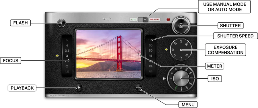
This is where DIGIX AMR1 becomes something more than a look-picker. A film simulation is not the end of the decision — it is the beginning of one. In Manual Mode you still control focus, shutter speed, ISO and exposure compensation, and the film you loaded should change how you use them, exactly as it did in 1985.
Slide film shooters learned to protect their highlights, because with half a stop of latitude a blown sky was simply gone. Try Chrome with exposure compensation at −⅓ or −⅔: colors deepen, skies hold, and saturation climbs the way Velvia users chased it.
Noir wants you to underexpose and mean it. Meter for the bright part of the face, let everything else collapse to black, and resist the urge to rescue the shadows. This is the one case where the light meter needle sitting dead centre is the wrong answer.
Tonal wants the opposite discipline. Adams' rule still applies: expose for the shadows. Give the dark areas enough light to hold detail and let the simulation manage the rest of the scale.
Instant and Fade like a little air. A touch of positive exposure compensation, +⅓ or so, lifts them into the soft, bright register they came from.
Mono rewards a low ISO and a steady hand — that is the whole promise of a fine-grain film. And if you want the grittier, harder-edged version of black and white, that is what Noir is for.
If any of that is unfamiliar, start with our guide to the exposure triangle, which walks through how ISO, shutter speed and aperture work together inside the app.
Choosing a film was never only a technical decision. It was a statement about how you intended to see.
Questions you might have
Are the film simulations just filters?
No. A filter is applied to a finished photo afterwards. A film simulation in DIGIX AMR1 is chosen before you shoot, the way you would have loaded a roll of film, and it determines how the camera renders color, contrast, and grain — Chrome, Fade, Instant, Mono, Noir, Process, Tonal, and Transfer each behave like the real emulsion or darkroom process that inspired them.
Can I change the film simulation between shots?
Yes. Unlike a real roll of film, which committed you for 24 or 36 exposures, you can load a different film simulation whenever you like. Each simulation applies as you shoot — you choose it before you take the picture, not afterwards.
Do the eight film simulations cost extra?
No. The film simulations are part of DIGIX AMR1 version 2.2 at no extra cost. Auto Mode is free for everyone, and Full Access — Manual Mode with focus, shutter speed, ISO, exposure compensation and lens switching — remains a one-time purchase with free updates forever.
Which film simulation should a beginner load first?
Start with the light. In hard, bright sun, load Chrome for color or Tonal for black and white. On flat, overcast days, load Fade. For warm indoor light and people, load Instant. And when a single strong light source cuts through darkness, load Noir. Matching the film to the light is the fastest way to learn what each one does.
Available Now in Version 2.2
All eight film simulations are part of DIGIX AMR1 version 2.2, alongside the camera you already know: the beautiful 1980s SLR body, the metal-feeling dials, the light meter needle in the viewfinder, and every lens on your iPhone with its real focal length and aperture displayed.
Auto Mode remains free for everyone. Full Access unlocks Manual Mode — focus, shutter speed, ISO, exposure compensation and lens switching — as a one-time purchase with free updates forever, which means these simulations arrived at no extra cost for everyone who already owns it.
Thank you to every DIGIX AMR1 photographer around the world. This feature exists because you kept asking for more ways to make deliberate pictures.
Now go load a roll. Pick before you shoot, commit to it, and let it change what you point the camera at. That constraint was never the limitation of film photography — it was the craft.
Learn more about the DIGIX AMR1 camera app here.
You can also read about the 1980s camera design behind DIGIX AMR1, and the making of the app.
Download DIGIX AMR1 on the App Store →
Experience beautiful 1980s camera design. Master manual photography. Choose your film.
Aldo



References
¹ "Film grain." Wikipedia. https://en.wikipedia.org/wiki/Film_grain
² "Reversal film." Wikipedia. https://en.wikipedia.org/wiki/Reversal_film
³ "Kodachrome." Wikipedia. https://en.wikipedia.org/wiki/Kodachrome
⁴ "Velvia." Wikipedia. https://en.wikipedia.org/wiki/Velvia
⁵ "Color Dye Fading." National Film Preservation Foundation. https://www.filmpreservation.org/preservation-basics/color-dye-fading
⁶ "KODAK PROFESSIONAL PORTRA 400 Film." Kodak Alaris. https://business.kodakmoments.com/product/kodak-professional-portra-400-film
⁷ "Polaroid SX-70." Wikipedia. https://en.wikipedia.org/wiki/Polaroid_SX-70
⁸ "How does temperature affect Polaroid film?" Polaroid Support. https://support.polaroid.com/hc/en-us/articles/115012361067-How-does-temperature-affect-Polaroid-film
⁹ "Instax." Wikipedia. https://en.wikipedia.org/wiki/Instax
¹⁰ "Panchromatic film." Wikipedia. https://en.wikipedia.org/wiki/Panchromatic_film
¹¹ "Kodak T-MAX." Wikipedia. https://en.wikipedia.org/wiki/Kodak_T-MAX
¹² "Film noir." Wikipedia. https://en.wikipedia.org/wiki/Film_noir
¹³ "KODAK PROFESSIONAL TRI-X 400 Film." Kodak. https://www.kodak.com/en/still-film/product/professional/tri-x-400-film/
¹⁴ "Cross processing." Wikipedia. https://en.wikipedia.org/wiki/Cross_processing
¹⁵ "Zone System." Wikipedia. https://en.wikipedia.org/wiki/Zone_System
¹⁶ "Dye transfer." Wikipedia. https://en.wikipedia.org/wiki/Dye_transfer
¹⁷ "The Red Ceiling." Wikipedia. https://en.wikipedia.org/wiki/The_Red_Ceiling
¹⁸ "Color Photographs by William Eggleston." The Museum of Modern Art, press release, 1976. https://www.moma.org/docs/press_archives/5391/releases/MOMA_1976_0051_40.pdf